How to Convert a Desktop Design to a Responsive Design- Part 3
Welcome back to the responsive design series. This tutorial series has been on a long hiatus because I started working on other updates and what not. But since I started working with my portfolio site with the aim of completing it, after several months I am reviving it to pick up where we left off.
In the last tutorial, Replacing Image Text with CSS, we modernized image text. In this one, we will modernize the content area, making it more responsive. This portfolio also used a lightbox script to show larger more detailed images. We will bring in the updated, responsive version of that script in the next one.
Getting Started
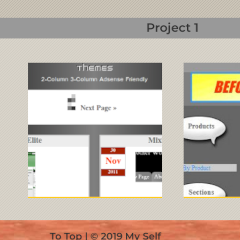
I created a GIMP mockup to show what I wanted the final design of the portfolio to look like, shown below.
Even though this step may or may not be necessary, it helps with design decisions later in the process. This particular design has small images of 200 by 200 pixels. A light yellow underline denotes which is a link. The link indication will make links clear enough to remove the verbose message “Click outlined images for a larger view.”
Official Color Scheme
A more modern approach to using colors is to apply CSS variables. Similar to how it is done in SASS, using variables replaces hard coded text colors with their variable names. For a small site like this, it may be negligible. But I will use an example here anyway, as variables work well for a site with a much larger stylesheet. If you wanted to adjust a color, you can do so from one source. At the top of style.css, add:
:root {
    --background-color: #cdc6b9;
    --text-color: #333333;
    --text-color-light: #ffffff;
    --link-color: #333333;
    --link-hover-color: #0000ff;
    --header-footer-bg: #993300;
    --nav-bg: #333333;
    --heading-color: #666666;
    --heading-highlight: #999999;
    --yellow: #ffff00;
    --sunglow: #ffcd2f;
}
To use CSS variables in your own website, where your colors exist, replace them with their custom property functions. Here are examples for the portfolio design.
body {
    background-color: var(--background-color);
    color: var(--text-color);
  …
}

.header {
    …
    background-color: var(--header-footer-bg);
}

.navigation__list {
    background-color: var(--nav-bg);
    …
}

.button--navigation,
.navigation__link:link,
.navigation__link:visited {
    color: var(--text-color-light);
    …
}

.content__title {
    color: var(--sunglow);
    …
}

.footer {
    background-color: var(--header-footer-bg);
    …
}

h1,
h2,
h3,
h4,
h5 {
    color: var(--heading-color);
}

a:link,
a:visited {
    color: var(--link-color);
}

a:hover,
a:focus {
    color: var(--link-hover-color);
}

hr {
    border-top: 1px solid var(--heading-highlight);
    border-bottom: 1px solid var(--heading-highlight);
    height: 3px;
    margin-bottom: 20px;
}
Headings, etc.
Let’s make the example’s entry header look better. Add this to style.css:
.entry__header h3 {
    background-color: var(--light-gray);
    color: var(--text-color);
    font-size: 1.125em;
    margin-top: 0;
    padding: 0.25em 0.5em;
    text-align: center;
}
In the new design, I also removed the excessive horizontal rules (<hr>).
The newest iteration uses numbered font weights provided by Google Fonts instead of keywords like bold, etc. Let’s fix this in the stylesheet. At the top of the header or header.php file, we will change the link to our custom fonts:
<link href="https://fonts.googleapis.com/css2?family=EB+Garamond:wght@600&family=Montserrat:wght@400;600&display=swap" rel="stylesheet">
Change some of the bold font weights to:
h1, h2, h3, h4, h5, h6 {
    …
    font-weight: 600;
}

...

.button--navigation,
.navigation__link {
    …
    font-weight: 600;
}
In addition, let’s give the button and nav links a font size:
.button--navigation,
.navigation__link {
    …
    font-weight: 600;
    font-size: 0.75rem;
}
We can also remove the coloring behind some of the headings in the example:
h3, h4, h5 {
    background-color: #999999;
}
In the Codepen at the bottom of this page I also added a subtitle, which we will style below:
.entry__subtitle {
    border-bottom: 3px double var(--light-gray);
    padding-bottom: 0.5em;
}

…

@media screen and (min-width: 768px) {
    …
    .entry__subtitle {
        margin-left: auto;
        margin-right: auto;
    }
}

@media screen and (min-width: 1366px) {
    …
    .entry__subtitle {
        max-width: 66.66%;
    }
}
Backgrounds, etc.
Next, we will add some new background textures behind certain elements. We can start with the body element. We are going to add another diagonal line design, for consistency.
body {
    …
    background-image: url(assets/diagonal-line-dark_right.png);
}
… and a solid color is behind each entry:
.entry {
    background-color: rgba(230, 227, 220, 0.5); /* #e6e3dc */
}
Content Area Layout
Now, we are getting to the meat of the tutorial. For the layout, I decided to go with CSS Grid, as it offers a precise way of aligning and organizing content for responsive design. Mozilla’s article Basic Concepts of grid layout describes how CSS Grid works.
Our Grid
We will apply a grid to each entry element:
.entry {
    background-color: rgba(230, 227, 220, 0.5); /* #e6e3dc */
    display: grid;
    grid-template-columns: 2em minmax(256px, auto) 2em;
    padding-bottom: 1em;
}
This is how the grid-template-columns property works. If you view the website in a responsive size (a small window), the 2em values on each side represent the offset from left and right, similar to padding. The minmax function tells the browser to not shrink the inner content below 256 pixels, otherwise the content area stretches to fit its content. 256 pixels was chosen because 2ems x 2 approximately equals 64 pixels. Adding those together gives a total minimum width of 320 pixels.
Grid Columns
After this process, everything should look mangled, but we will fix that now. We will do so by placing the child elements within grid columns. There are a few ways to name grid lines. However, to keep it simple, we will go with numbered lines.
As of right now, we have three columns. Each column has a number for the beginning and end of the column. Numbers are 1 to 2 for the first column, 2 to 3 for the second and so forth. So first, we want the entry header to span all the way across (from 1 to 4), as shown below in code:
.entry__header {
    grid-column: 1 / 4;
}
Our content will sit within the 3rd and 4th column. But first, we need to adjust our HTML to add an entry__content div around the content. In addition, we can remove the centered class.
<article class=”entry”>
…
    <div class="centered">
    <div class=”entry__content”>
        <a href="#" ><img src="https://www.jgpws.com/tutorials/images/portfolio-example/jgd_themes_small.png" width="300" height="194" border="0" alt="Jason G. Designs Themes page" title="Jason G. Designs Themes page" /></a>
    </div>
        <p>...</p>
    </div>
</article>
Now we can move the content into the column structure:
.entry__content {
    grid-column: 2 / 3;
}
Columns for Larger Screens
For larger screens, we will make the side “margins” larger to push the content in. We will also make the paragraph text no longer than a certain amount of characters wide. Let’s add these style rules to our tablet media query:
@media screen and (min-width: 768px) {
    …
    .entry {
        grid-template-columns: 12.5% auto 12.5%;
        min-height: 100%;
    }
}
We can now adjust any margins or padding around the paragraphs and set a max-width:
p,
ul,
ol {
    font-size: 0.9em;
    line-height: 1.5;
    padding-left: 25%;
    padding-right: 25%;
}

.content p,
.content ul,
.content ol {
    max-width: 60ch;
    margin: 2em auto;
}
Right now, the content area is only stretching the width of its enclosing content, which if too short, doesn’t span the width of its container. We will fix that by making the container width 100% minus the width of the sidebar in wide view. For that, we will use calc.
@media screen and (min-width: 768px) {
    .content {
        …
        width: auto;
        width: calc(100% - 200px);
    }
}
Creating Galleries
We are going to create a couple of galleries for our portfolio pieces. First we will add new thumbnail sizes that work in mobile and desktop. Then, we will link the thumbnails to their full size images.
Replace the existing HTML with the following:
<article class="entry">
    …
    <div class="entry__content">
        <div class="centered"><a href="#" ><img src="http://www.jgpws.com/tutorials/images/portfolio-example/jgd_themes_small.png" width="300" height="194" border="0" alt="Jason G. Designs Themes page" title="Jason G. Designs Themes page" /></a></div>
        <div class="gallery">
            <a href="http://www.jgpws.com/tutorials/images/portfolio-example/jgd_themes.png"><img src="http://www.jgpws.com/tutorials/images/portfolio-example/jgd_themes_small2.png" width="200" height="200" alt="Jason G. Designs Themes page" title="Jason G. Designs Themes page" /></a>
            <a href="http://www.jgpws.com/tutorials/images/portfolio-example/JGD_webpic_02.jpg"><img src="http://www.jgpws.com/tutorials/images/portfolio-example/JGD_webpic_02_small2.jpg" width="200" height="200" alt="JGD Shop" title="JGD Shop" /></a>
        </div>
        <p>…</p>
    </div>
</article>

<article class="entry">
    …
    <div class="entry__content">
        <div class="centered"><a href="#"><img src="https://www.jgpws.com/tutorials/images/portfolio-example/prepaidcredit_webpic_02_small.jpg" width="300" height="181" alt="GetYourPrepaidCreditCard.net front page" title="GetYourPrepaidCreditCard.net front page" /></a></div>
        <div class="gallery">
            <a href="http://www.jgpws.com/tutorials/images/portfolio-example/prepaidcredit_webpic01.jpg"><img src="http://jgpws.com/tutorials/images/portfolio-example/prepaidcredit_webpic01_small2.jpg" width="200" height="200" border="0" class="margin" alt="GetYourPrepaidCreditCard.net front page" title="GetYourPrepaidCreditCard.net front page" /></a>
            <a href="http://www.jgpws.com/tutorials/images/portfolio-example/prepaidcredit_webpic02.jpg"><img src="http://www.jgpws.com/tutorials/images/portfolio-example/prepaidcredit_webpic02_small2.jpg" width="200" height="200" alt="GetYourPrepaidCreditCard.net offers page" title="GetYourPrepaidCreditCard.net offers page" /></a>
        </div>
    </div>
</article>
Now we can style the gallery with flexbox to make it look neater:
.gallery {
    display: flex;
    align-items: flex-end;
    flex-wrap: wrap;
}

.gallery > a {
    margin: 0 auto;
}

…
@media screen and (min-width: 768px) {
    …
    .gallery {
        flex-direction: row;
        justify-content: center;
    }
    …
}
The images in the gallery are butted up right next to each other; let’s put some space in between. In our content area, we can put margins around all images globally. To account for larger images, we will also give a max-width of 100% minus 2ems, for each side margin to stop large images from expanding outside of the parent element. A height of auto keeps the aspect ratio proportional.
.content img {
    height: auto;
    margin: 1em;
    max-width: calc(100% - 2em);
}
For our thumbnails, we want to give viewers a visual indicator that they are links. For my portfolio’s design, I gave each thumbnail a yellow border underneath. On hover, the border fades in another line at the top.
a,
.content a img {
    transition: 0.5s;
}

…
.content a img {
    border-top: 2px solid transparent;
    border-bottom: 2px solid var(--sunglow);
}

.content a img:hover,
.content a img:focus {
    border-top: 2px solid var(--sunglow);
}
Now we can remove the “Click outlined images..” instructions at the top of the page.
<p class="centered">Click outlined images for a larger view.</p>
Content Buttons
The “View Website” link below the second entry looks a little plain. Let’s style this as a button.
<p class="centered"> <a href="#">View Website</a> </p><a class="button button--link" href=”#”>View Website</a>
First, for the button’s style, we will add a new color variable to our root element, pale gray. Then we will style the button with the new color.
:root {
    …
    --pale-gray: #dedede;
}

…
.button {
    background-image: linear-gradient(to bottom,
      rgba(255, 255, 255, 0.25),
      rgba(0, 0, 0, 0.25));
    background-color: var(--pale-gray);
    border-top: 1px solid #c0c0c0;
    border-bottom: 1px solid #c0c0c0;
    font-size: 0.9rem;
    font-weight: 600;
    display: block;
    margin: 0.5em auto;
    max-width: 60ch;
    padding: 10px;
    text-align: center;
    text-decoration: none;
}

.button:link,
.button:visited {
    color: var(--text-color);
}

.button:focus,
.button:hover {
    background-image: linear-gradient(to bottom,
      rgba(0, 0, 0, 0.25),
      rgba(255, 255, 255, 0.25));
    color: var(--link-hover-color);
}
Footer Fixes
As of right now, the example has a fake “Back to Entry Page” link. In place of that, a “To Top” link that scrolls back to the top of the page would be cooler. We can even utilize the CSS property scroll-behavior to add smooth scrolling. First, we need to adjust some more HTML.
<body>
<a id="top"></a>
…
<footer id="footer" class="footer">
<p class="centered"><a href="#">Back to Entry Page</a> | © 2019 My Self</p>
<p class="footer__content">
<a href="#top">To Top</a> | © 2020 My Self
</p>
</footer>
Of course, with this we will need to add some new styling.
html {
    scroll-behavior: smooth;
}

.footer__content,
.footer__content a {
    font-weight: 600;
}

.footer__content {
    margin-left: 2em;
    margin-right: 2em;
    text-align: center;
}
Conclusion
We learned how to “modernize” the content area of a converted early 2000s era website, making it responsive. However, we learned some new techniques. To sum it all up in a list, we:
- Made use of CSS variables for a color scheme, making possible changes easy
- Made custom heading styles separate from our main heading styles
- Used a modern grid system for a precise layout– CSS Grid
- Created custom gallery and button styles
- Implemented a smooth scroll to top feature in our fixed footer
The Codepens below show the before and after from the previous tutorial to this one.
See the Pen Portfolio layout CSS text by Jason Gonzalez (@jgpws) on CodePen.
See the Pen Portfolio layout Responsive content by Jason Gonzalez (@jgpws) on CodePen.
Thank you for following this tutorial series thus far. As promised next, we will look at the lightbox script for our galleries. Ahead of that will be animations. See ya’ in the next one.
Trackbacks and Pingbacks
Trackback URL for this post: https://www.jasong-designs.com/2020/08/02/how-to-convert-desktop-to-responsive-design-part-3/trackback/
[…] How to Convert a Desktop Design to a Responsive Design- Part 3 […]