How to Convert a Desktop Design to a Responsive Design- Part 2
Welcome to part 3 of this responsive design series, even though the title suggests a second tutorial. In part 1, we converted XHTML code to HTML5. In the second tutorial, we focused on adjusting the CSS for the main layout elements. This time, the focus will be on responsive navigation design for this example portfolio.
Again, like in the last tutorial, I will provide Codepen examples at the end. Let’s get rollin’, shall we?
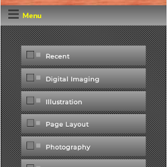
The Original Look
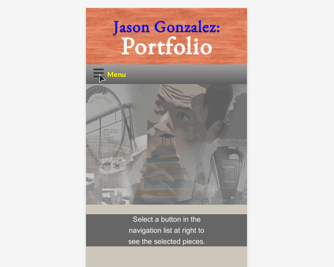
The screenshot below depicts the original buttons in Firefox’s Responsive Design View.
Our plan is to first use CSS to render the backgrounds behind the buttons (image replacement for this purpose is outdated), then make the entire navigation list disappear in mobile, add a button and JavaScript to hide and show the list, and finally add some slick animation.
The Code
So, this is the navigation CSS we were left with in the last tutorial Codepen:
.navigation {
    background-color: #333333;
    background-image: url(http://www.jgpws.com/tutorials/images/portfolio-example/diagonals_left.gif);
    height: 100%;
    padding-top: 2em;
    z-index: 0;
}

.navigation__list ul {
    margin-top: 112px;
    padding: 0;
    list-style-type: none;
    font-size: 0.7em;
}

.navigation__list-item {
    margin-left: 18px;
}


.navigation__link {
    background-image: url(http://www.jgpws.com/tutorials/images/portfolio-example/button_pf_up.gif);
    background-position: 0% 50%;
    background-repeat: no-repeat;
    display: block;
    padding-left: 40px;
    padding-top: 10px;
    padding-bottom: 10px;
}

.navigation__link:link,
.navigation__link:visited{
    color: #FFFFFF;
    text-decoration: none;
}

.navigation__link:hover,
.navigation__link:focus {
    background-image: url(http://www.jgpws.com/tutorials/images/portfolio-example/button_pf_over.gif);
    background-position: 0% 50%;
    color: #FFFF00;
    text-decoration: underline;
}
…
@media screen and (min-width: 768px) {
    .navigation {
      width: 160px;
      position: fixed;
    }

    .content {
      left: 160px;
      position: absolute;
      top: 112px;
      width: auto;
    }
}
The first thing we will do is make an adjustment to the header and give the .navigation aside a width of 100%. The header in mobile now should be positioned as static.
.header {
    …
    position: absolute;
    top: 0;
    …
}

@media screen and (min-width: 768px) {
    .header {
        position: absolute;
        top: 0;
     }
}

.navigation {
     …
    padding-top: 2em;
    width: 100%;
    z-index: 0;
}
CSS to replace background images
Now, we can remove the background-image behind the buttons and replace them with a CSS gradient:
.navigation__link {
    background-image: url(http://www.jgpws.com/tutorials/images/portfolio-example/button_pf_up.gif);
    background-position: 0% 50%;
    background-repeat: no-repeat;
    background-image: linear-gradient(to bottom,
        rgba(255, 255, 255, 0.25),
        rgba(0, 0, 0, 0.25));
    background-color: #808080;
    display: block;
}
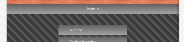
The screenshot below shows something similar, even though I initially got the gradient backwards– the highlight for the design actually goes from light to dark, as described above.
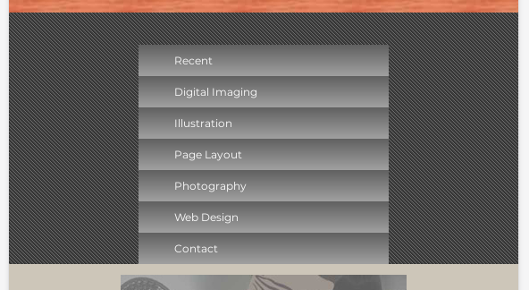
Next, we can apply Flexbox to the unordered list to ease laying out. In addition, we can make a few small tweaks shown below. Simply remove everything crossed out and replace with the code in bold:
.navigation__list {
    font-size: 0.75rem;
}

.navigation__list ul {
    margin-top: 112px;
    padding: 0;
    list-style-type: none;
    font-size: 0.7em;
    display: flex;
    flex-direction: column;
    margin: 1em auto;
    max-width: 240px;
}

.navigation__list-item {
    list-style-type: none;
    margin-left: 18px;
    margin: 0.25em 0;
}
We will now apply each button’s hover state:
.navigation__link:hover,
.navigation__link:focus {
    background-image: linear-gradient(to bottom,
        rgba(0, 0, 0, 0.25),
        rgba(255, 255, 255, 0.25));
    background-image: url(assets/button_pf_over.gif);
    background-repeat: no-repeat;
    background-position: 0% 50%;
    color: #FFFF00;
    text-decoration: underline;
}
Make the Menu Sticky
I thought it would be a good idea to make the menu in mobile “stick” when scrolled to the top of the browser. This feature used to require JavaScript, but we will make use of the CSS sticky property.
To apply sticky, I had to adjust some of the code for it to work. While doing this, I also switched the background image to a semi-transparent .png file.
.navigation {
    background-color: #333333;
    background-image: url(http://www.jgpws.com/tutorials/images/portfolio-example/diagonals_left.gif);
    height: 100%;
    padding-top: 2em;
    position: sticky;
    top: 0;
    width: 100%;
    z-index: 0;
}

.navigation__list {
    background-color: #333333;
    background-image: url(http://www.jgpws.com/tutorials/images/portfolio-example/diagonal-line_left.png);
    font-size: 0.75rem;
    padding: 2em 0;
    width: 100%;
}
We need to fix the code in the desktop layout as well.
@media screen and (min-width: 768px) {
    .navigation {
        height: 100%;
        position: fixed;
        width: 160px;
        width: 200px;
    }

    .navigation__list {
        height: 100%;
        padding-top: 140px;
    }

    .content {
        left: 160px;
        left: 200px;
        position: absolute;
        top: 112px;
        width: auto;
    }
}
Add a Menu Button
The next thing to do is add the button that will hide and show the menu. Let’s adjust the HTML in the main_nav include or navigation section.
<aside class="navigation">
    <button id="main-nav" class="button--navigation"><span class="button__title--navigation">Menu</span></button>
    <nav class="navigation__list">
    …
    </nav>
</aside>
Plus, add the CSS to style it:
.button—navigation,
.navigation__link {
    background-image: linear-gradient(to bottom,
        rgba(255, 255, 255, 0.25),
        rgba(0, 0, 0, 0.25));
    background-color: #808080;
    display: block;
}

.navigation__link {
    display: block;
    padding: 10px;
}

.button—navigation,
.navigation__link:link,
.navigation__link:visited{
    color: #FFFFFF;
    font-weight: bold;
    text-decoration: none;
}

.button--navigation:hover,
.button--navigation:focus,
.navigation__link:hover,
.navigation__link:focus {
    background-image: linear-gradient(to bottom,
        rgba(0, 0, 0, 0.25),
        rgba(255, 255, 255, 0.25));
    color: #FFFF00;
}

.button--navigation {
    align-items: center;
    border: transparent;
    display: flex;
    font-weight: bold;
    justify-content: flex-start;
    padding: 0.5em 1em;
    width: 100%;
}
Use JavaScript to add a hide/show class
We will simply add a class, open, that will display the navlist in mobile when clicked once, then remove when clicked again. But first, we will want to hide the menu initially when in the mobile size.
To hide the menu, we will use absolute positioning. But, we are going to move it offscreen with CSS Transform. This will aid in our animation that we add later.
.navigation__list {
    background-color: #333333;
    background-image: url(http://www.jgpws.com/portfolio/assets/diagonal-line_left.png);
    font-size: 0.75rem;
    padding: 2em 0;
    position: absolute;
    transform: translate(-100%);
    transition: 1s;
    white-space: nowrap;
    width: 100%;
}
The adding of white-space: nowrap is to make sure text in the buttons don’t wrap, making the buttons taller.
Next, we can create a new file, scripts.js and save into a .js folder. We can now link to this script in the footer:
        <footer id="footer" class="footer">
        …
        </footer>
    </div><!-- closes wrapper div -->
<script src="js/scripts.js"></script>
</body>

</html>
Within this new file, add the following code:
/* Main menu hide and show */

var mainNavBtn = document.querySelector('#main-nav');
var mainNav = document.querySelector('.navigation__list');

mainNavBtn.onclick = function() {
    //console.log(mainNav.classList);
    mainNav.classList.toggle('open');
}
This is pretty straight forward. It uses JavaScript’s classList property and toggle method to add and remove the open class with each click. If you view this code in the code inspector, you can see the class toggling in action.
Now we need to add the CSS that shows the list:
.navigation__list.open {
    height: auto;
    transform: translate(0);
}

@media screen and (min-width: 768px) {
    .navigation__list {
        padding-top: 140px;
    }

    .navigation__list,
    .navigation__list.open {
        height: 100%;
        transform: translate(0);
    }
}
The transition of 1s takes care of the animation for us, as well. This design slides the menu in from the left.
Adding Icons to our Buttons
Below are linked the icons that go with the theme of this portfolio. Of course, you may have your own design, but these particular images are just for the purposes of this example.
.button--navigation::before {
    content: url(http://www.jgpws.com/tutorials/images/portfolio-example/menu-icon.svg);
}

.button__title--navigation {
    padding-left: 0.5em;
}
…

.navigation__link::before {
    content: url(http://www.jgpws.com/tutorials/images/portfolio-example/navbutton_design.svg);
    margin-right: 10px;
}

.navigation__link:hover::before,
.navigation__link:focus::before {
    content: url(http://www.jgpws.com/tutorials/images/portfolio-example/navbutton_design-hover.svg);
 }
Conclusion
There is quite of bit of code involved with responsive navigation design and each design differs depending on what goal your navigation is trying to achieve. Below are the Codepen before and afters.
See the Pen Portfolio layout mobile by Jason Gonzalez (@jgpws) on CodePen.
See the Pen Portfolio layout new navigation by Jason Gonzalez (@jgpws) on CodePen.
Trackbacks and Pingbacks
Trackback URL for this post: https://www.jasong-designs.com/2019/11/11/how-to-convert-desktop-to-responsive-design-2/trackback/
[…] How to Convert a Desktop Design to a Responsive Design- Part 2 […]