How to Convert a Desktop Design to a Responsive Design- Part 1
In a previous article, I described how while redesigning my portfolio, I updated the code to use HTML5 rather than XHTML. In this follow-up, we will explore how to convert the previous desktop only design to a responsive design using CSS. We will focus only on laying out the main sections: header, sidebar (which also is the main navigation) and footer.
In the next tutorials after this one, we will apply CSS Grid to the main content area, and adjust the navigation to use a button dropdown in mobile– a necessity for responsive design.
At the end of the tutorial I will provide Codepen examples to show the before and after.
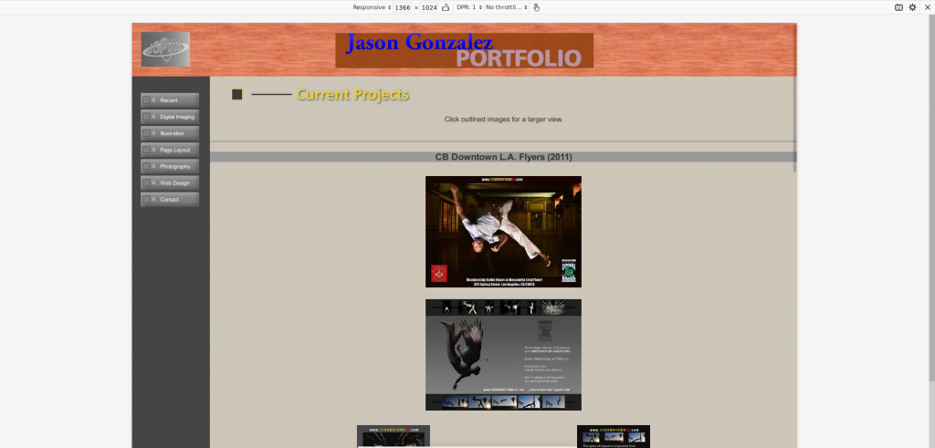
The Existing Site
I will not be changing the look of the portfolio too drastically, but the underlying code. The screenshot below shows the existing look in Firefox Development Tools.
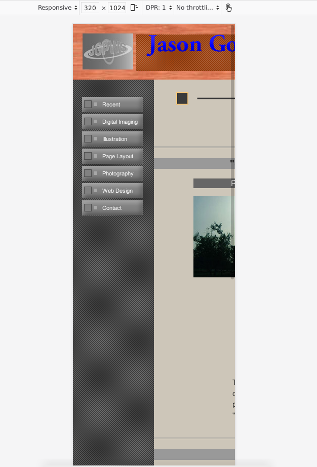
…And the existing look in mobile.
Since our focus is on mobile, in the end it should look like the following– a total mess.
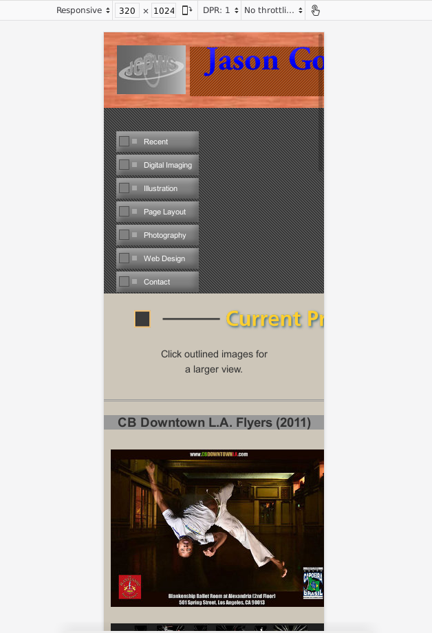
Even though the after layout looks terrible, we will address the content area and navigation in a follow-up.
The Main Site Elements
In this part of the tutorial, we will look at my existing code from top to bottom, each section at a time: header, sidebar (nav), content area and footer.
One other thing I mentioned in the previous tutorial was using Block, Element, Modifier (BEM) syntax for the CSS classes. We will also explore that further.
The Header
In the last tutorial, we had the following HTML for the header:
<body class="bgImage">
    <div id="wrapper" class="wrapper"> <!-- opens wrapper div -->
        <header id="header" class="header centered">
            <div>
               <a href="../index.html"  id="jgpwslink" title="JGPWS logo">Back to JGPWS</a>
             </div>
             <div>
                 <h1><a href="index.php" id="mastheadlogo" title="Jason Gonzalez Portfolio logo">Jason Gonzalez: Portfolio</a></h1>
             </div>
         </header>
Now, in the header.php include, we want to add a header__title wrapper just after the header tag as shown below:
<header id="header" class="header centered">
     <div>
         <a href="../index.html"  id="jgpwslink" title="JGPWS logo">Back to JGPWS</a>
     </div>
     <div>
     <h1 class=”header__title”><a href="index.php" id="mastheadlogo" title="Jason Gonzalez Portfolio logo">Jason Gonzalez: Portfolio</a></h1>
     </div>
</header>
Once again, the crossed out text represents code that can be removed. We will not actually use the header__title in CSS until further. The point here is that in BEM, header__title is an element of the header block. The header is a standalone entity with the header__title being something that belongs with, or inside of, the header.
The CSS for the header has a helper class that centers everything:
.centered {
    text-align: center;
}
The portfolio’s layout uses absolute and fixed positioning for the header, sidebar and footer:
.header {
     background-color: #993300;
     height: 112px;
     min-width: 780px;
     position: absolute;
     width: 100%;
     z-index: 1;
}
The .wrapper class that surrounds everything has 100% width and min-height:
.wrapper {
     margin: 0;
     min-height: 100%;
     position: relative;
     width: 100%;
     z-index: 0;
}
The only thing that needs to be changed here is to remove the minimum width:
.header {
    background-color: #993300;
    height: 112px;
    min-width: 780px;
    position: absolute;
    width: 100%;
    z-index: 1;
}
The Navigation
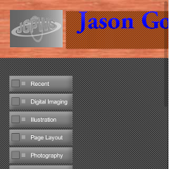
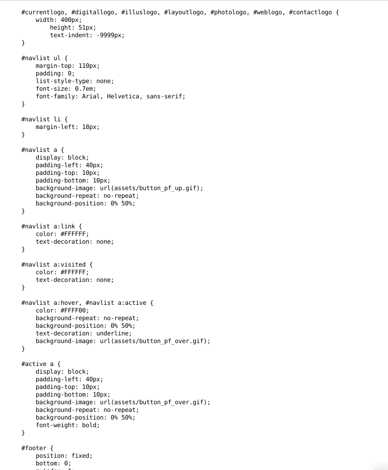
Since the navigation list code is a lot, I included a screenshot below.
First of all, we want to change some code in the main_nav.php file (shown in bold):
<aside class="left">
     <nav class="navlist">
         <ul>
             <li><a href="current_recent.php" title="Recent/Current Projects">Recent</a></li>
             <li><a href="digital_imaging.php" title="Digital Imaging">Digital Imaging</a></li>
             <li><a href="illustration.php" title="Illustration">Illustration</a></li>
             <li><a href="layout.php" title="Page Layout">Page Layout</a></li>
             <li><a href="photography.php" title="Photography">Photography</a></li>
             <li><a href="web_design.php" title="Web Design">Web Design</a></li>
             <li><a href="contact.php">Contact</a></li>
         <ul>
    </nav>
</aside>
<aside class="navigation">
    <nav class="navigation__list">
        <ul>
            <li class="navigation__list-item"><a class="navigation__link" href="current_recent.php" title="Recent/Current Projects">Recent</a></li>
            <li class="navigation__list-item"><a class="navigation__link" href="digital_imaging.php" title="Digital Imaging">Digital Imaging</a></li>
        …
        </ul>
    </nav>
</aside>
The class .left now becomes .navigation and with that new class we can change some more things. We need to take anything specific to the desktop and put it into a new media query. Shown is the before and after:
.navigation {
    background-color: #333333;
    height: 100%;
    padding-top: 2em;
    position: fixed;
    width: 160px;
    z-index: 0;
}
@media screen and (min-width: 768px) {
    .navigation {
        width: 160px;
        position: fixed;
    }
}
Now the position remains static until we get to at least a tablet width, then the position becomes fixed to the left side.
The Content Area
In our content area, if you recall in the last tutorial, we added a .content class to the new main html element. The CSS in the previous desktop design vs. the new one moves the margin and position properties to the new media query:
.content {
    margin-top: 112px;
    margin-left: 160px;
    min-width: 620px;
    padding-bottom: 55px;
    position: absolute;
    width: 100%;
    z-index: 0;
}
@media screen and (min-width: 768px) {
    .content {
        left: 160px;
        min-width: 620px;
        position: absolute;
        top: 112px;
        width: auto;
    }
}
In the new tablet and up width, the margins are converted to absolute pixel values and the width is changed to auto. The minimum width is removed here, as well.
The Footer
Finally, with the footer the original CSS code for my portfolio is posted below. The only change is to get rid of the minimum width:
.footer {
    background-color: #993300;
    bottom: 0;
    height: 55px;
    min-width: 780px;
    width: 100%;
    z-index: 1;
}
Codepen Examples
Desktop
See the Pen Portfolio layout desktop by Jason Gonzalez (@jgpws) on CodePen.
Mobile
See the Pen Portfolio layout mobile by Jason Gonzalez (@jgpws) on CodePen.
Wrapping up this tutorial, the whole layout looks once again messy. But, we will fix that soon, looking at the navigation and content styling next. This part of responsive design just focuses on the main layout. See ya!
Trackbacks and Pingbacks
Trackback URL for this post: https://www.jasong-designs.com/2019/10/26/how-to-convert-desktop-to-responsive-design-1/trackback/
[…] How to Convert a Desktop Design to a Responsive Design- Part 1 […]