Replacing Image Text with CSS
Welcome to the next tutorial in the series of modernizing an old desktop layout. In the previous tutorial, How to Convert a Desktop Design to a Responsive Design- Part 2, you may have noticed in some of the screenshots, that the header text looked different than originally depicted. That is because I used some CSS techniques to replace the image based banners. A how to on this will be the topic of this tutorial. We will be replacing image text with some CSS3 effects.
Using New Fonts
The first thing is that we want to bring in new fonts that match the ones previously used in the header. Plus, I want to use something more modern than Arial for the body font. For this design, I chose EB Garamond and Montserrat. Of course, your own design may use totally different fonts. For this purpose, let’s grab these from Google Fonts:
<head>
    …
    <title>Jason Gonzalez Portfolio</title>
    <link href="https://fonts.googleapis.com/css?family=EB+Garamond|Montserrat&display=swap" rel="stylesheet">
    <link href="style.css" rel="stylesheet">
</head>
Next, set Montserrat as the body text:
body {
    …
    font-family: Arial, Helvetica, sans-serif;
    font-family: Montserrat, sans-serif;
}
The HTML and CSS
<header id="header" class="header centered">
    <h1 class=”header__title”><a href="#" id="mastheadlogo" title="Jason Gonzalez Portfolio logo">Jason Gonzalez: Portfolio</a></h1>
</header>
#mastheadlogo {
    background-image: url(http://www.jgpws.com/tutorials/images/portfolio-example/name_banner.gif);
    height: 72px;
    display: block;
    margin: 19px auto 0 auto;
    text-indent: -9999px;
    width: 530px;
}
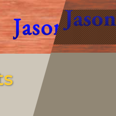
The code above shows how the top heading is rendered; it places an image banner on the screen while indenting the actual text offscreen. The design is a vertical gradient on some of the text. What we will do is replicate the look of that text using CSS.
First, we will have to change the structure of the header, in order to accommodate a dual color scheme for the main title:
<header id="header" class="header centered">
    <h1 class="header__title">
        <span class="header__title--blue">
           <a href="#">Jason Gonzalez:</a>
        </span>
        <span class="header__title--white">
            <a href="#">Portfolio</a>
        </span>
    </h1>
</header>
We no longer need to reference the #mastheadlogo id, as it no longer exists:
#mastheadlogo {background-image: url(http://www.jgpws.com/tutorials/images/portfolio-example/name_banner.gif);height: 72px;display: block;margin: 19px auto 0 auto;text-indent: -9999px;width: 530px;}
Instead, we’re going to use CSS Gradient Text to style the main heading; Also we will apply Flexbox to our header to eliminate strange margin issues that have popped up in mobile size:
.header {
    align-items: center;
    background-color: #993300;
    background-image: url(assets/wood_pattern01.jpg);
    display: flex;
    height: 112px;
    justify-content: center;
    padding: 0 1em;
    width: 100%;
    z-index: 1;
}

.header__title a:link,
.header__title a:visited {
    font-family: 'EB Garamond', serif;
    font-weight: bold;
    text-decoration: none;
    -webkit-background-clip: text;
    -webkit-text-fill-color: transparent;
}

.header__title--blue,
.header__title--white {
    display: block;
}

.header__title--blue {
    color: #0f0fff;
    font-size: 2rem;
}

.header__title--blue a {
    background: -webkit-linear-gradient(#0f0fff, #0f0fff, #080880);
}

.header__title--white {
    font-size: 3rem;
}

.header__title--white a {
    background: -webkit-linear-gradient(#ffffff, #ffffff, #ebebeb);
}
CSS-Tricks says this is a Webkit only property, but I’m coding in Firefox and it works in that browser as well. The gradient is first set on the anchor text, creating gradient blocks. The background is then clipped with the character shapes; the fill color is set to transparent to remove the original text color.
Next, we are going to use some more CSS3 effects for the section titles. Our first order is to also change the HTML a little bit.
<main id="main" class="content">
    <h2 title="Current Projects" id="currentlogo">Current Projects</h2>
    <p class="centered">Click outlined images for a larger view.</p>
    <hr>
<main id=”main” class=”content”>
    <h2 title="Current Projects" id="currentlogo" class="content__title">Current Projects</h2>
    …
    <hr>
Fixing our Headings
I just noticed that there are no proper heading sizes in our layout. After asking Google what are the proper font sizes for headings, I came across the article A More Modern Scale for Web Typography at Typecast. This method chooses font sizes according to the screen’s size and is a good method to adopt here.
/* Content Styles */
…

h1 {
    font-size: 2em;
    line-height: 1.25em;
}

h2 {
    font-size: 1.625em;
    line-height: 1.15em;
}

h3 {
    font-size: 1.375em;
    line-height: 1.14em;
}

h4 {
    font-size: 1.125em;
    line-height: 1.11em;
}

…

@media screen and (min-width: 768px ) {
    h1 {
        font-size: 2.5em;
        line-height: 1.125em;
    }

    h2 {
        font-size: 2em;
        line-height: 1.25em;
    }

    h3 {
        font-size: 1.5em;
        line-height: 1.25em;
    }

    h4 {
        font-size: 1.125em;
        line-height: 1.22em;
    }
}

@media screen and (min-width: 1366px) {
    h1 {
        font-size: 3em;
        line-height: 1.05em;
    }

    h2 {
        font-size: 2.25em;
    }

    h3 {
        font-size: 1.75em;
    }

    h4 {
        font-size: 1.125em;
    }
}
Changing the headlines prompts us to slightly adjust our previous main heading CSS.
.header__title--blue {
    color: #0f0fff;
    font-size: 2rem;
}
The Section Title Styling
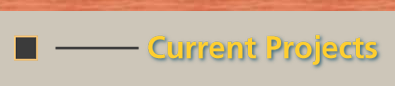
Next is the actual styling of the section title. The original is an image of yellow text with a drop shadow, which we will now create with CSS. First, we must remove the code that hides the original text.
.content__title {
    height: 51px;
    margin: 0.5em 0 0 1em;
    padding: 0;
    text-indent: -9999px;
    width: 400px;
}
And this was the code for the Current Projects title:
#currentlogo {
    background-image: url(http://www.jgpws.com/tutorials/images/portfolio-example/masthead_current.png);
    height: 51px;
    text-indent: -9999px;
    width: 400px;
}
If you save, you should now see the background image text with the regular text layered on top. We can now remove #currentlogo from the html and its reference in the CSS; it is no longer needed.
<main id=”main” class=”content”>
    <h2 title="Current Projects" id="currentlogo" class="content__title">Current Projects</h2>
    …
<hr>
#currentlogo {background-image: url(http://www.jgpws.com/tutorials/images/portfolio-example/masthead_current.png);height: 51px;text-indent: -9999px;width: 400px;}
Replace with this CSS that colors and adds a drop shadow to our heading.
.content__title {
    color: #ffcd2f;
    padding: 0 1em;
    text-align: center;
    text-shadow: 1px 1px 2px rgba(0, 19, 25, 0.5); /* #003040 */
}
Just like in the text image, our text shadow gives a subtle pop to make the light text stand out against the light background.

Extra Title Designs
There is also a small design that goes to the left of the section title. I decided to include this design in tablet sizes and above, as it doesn’t fit well for mobile size.
@media screen and (min-width: 768px) {
    …
    .content__title::before {
        content: url(http://www.jgpws.com/tutorials/images/portfolio-example/section_heading_design.svg);
        margin-right: 0.5em;
    }

    .content__title {
        text-align: left;
    }
    …
}
Codepen Before and After
Below are the two codepens from where we left off in the last tutorial to where we are now.
See the Pen Portfolio layout new navigation by Jason Gonzalez (@jgpws) on CodePen.
See the Pen Portfolio layout CSS text by Jason Gonzalez (@jgpws) on CodePen.
And that is all there is to replacing image text with CSS. As you can see, CSS can now do what used to require images and even in some cases replaces JavaScript. Indeed, the website Quackit lists a ton of CSS3 properties by subject. Check it out.
Thanks for reading and I will see you for the next tutorial.
Trackbacks and Pingbacks
Trackback URL for this post: https://www.jasong-designs.com/2019/11/19/replacing-image-text-with-css/trackback/
[…] the last tutorial, Replacing Image Text with CSS, we modernized image text. In this one, we will modernize the content area, making it more […]