How to Apply CSS Grid to Gutenberg Wide and Full Alignment
For about a year, as you know, WordPress has replaced the TinyMCE editor with a new one that uses blocks. Gutenberg, now known as WordPress 5.0 and up, allows blocks to be placed on the page and moved around for a richer editing experience. A few blocks, such as the Image, Cover Image and Column, have the option of spanning a wider width than the parent container.
In today’s tutorial, we are going to use CSS Grid for the wide/full alignment options, instead of using negative margins. Particularly, we will use grid-template-columns to put the alignments in place with and without a sidebar. This tutorial works best for applying to a theme you are creating or one that isn’t updated for Gutenberg.
Setting up Gutenberg Wide and Full Alignment
If your theme has a setup function, you can add theme support within it:
function theme_slug_setup() {
    …
    add_theme_support( 'align-wide' );
    …
}

add_action( 'after_setup_theme', 'theme_slug_setup' );
Now you will see the wide and full alignment options for certain blocks.
Your Possible Existing Non-Sidebar Layout
This part isn’t an exact science because the underlying code differs from theme to theme. The examples used here copy the code for Underscores, a starter theme many theme developers use. A Codepen for a couple of layout types is below.
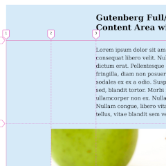
See the Pen Gutenberg Full/Wide Example before by Jason Gonzalez (@jgpws) on CodePen.
Margin Based
The first layout in the first pen uses margins inside the .entry-header and .entry-content elements:
img {
    height: auto;
    max-width: 100%;
}

/* Layout */
.entry-header,
.entry-content {
    margin: 0 5%;
    width: 90%;
}

@media (min-width: 768px) {
    .entry-header,
    .entry-content {
        margin: 0 12.5%;
        width: 75%;
    }
}

@media (min-width: 1366px) {
    .entry-header,
    .entry-content {
        margin: 0 25%;
        width: 50%;
    }
}
Some themes, like the Gutenberg example theme, may apply a maximum width to the content, similar to the following:
.entry-content > * {
    margin: 1.5em auto;
    max-width: 740px;
}
We will cover this later in the tutorial as well.
You can ignore the preceding id selectors in the Codepen CSS style rules, those are only to differentiate between the two examples.
Also, my example doesn’t have an entry footer, but these style rules would apply to that, as well.
Convert the Non-Sidebar Layout to CSS Grid
Since this layout spans the entire screen width, we can convert the elements in question to use CSS Grid, like in the second Codepen example. Erase the code for the margin based layout and replace it with the following:
.entry-content,
.entry-header {
    display: grid;
    grid-template-columns: 1fr 90% 1fr;
}

.entry-content > *,
.entry-header > * {
    grid-column: 2 / 3;
}

@media (min-width: 768px) {
    .entry-content,
    .entry-header {
        grid-template-columns: 1fr 75% 1fr;
    }
}

@media (min-width: 1366px) {
    .entry-content,
    .entry-header {
        grid-template-columns: 1fr 50% 1fr;
    }
}
What this new layout does is specifies a percentage for the middle column and divides up the rest of the space equally with the fr unit.
Since the Gutenberg example theme has a max-width set on everything inside the .entry-content div, the content stretches with the percentage specified in grid-template-columns until you hit 740px. For that theme’s layout, you can remove the .entry-header selectors, as we are focusing only on the content.
Your Possible Sidebar Layout
The sidebar based layout is handled somewhat differently from the non-sidebar one. These examples show possible sidebar layouts, but the main focus once again will be on the entry content areas. Keep in mind that this design places the sidebar right next to the content.
See the Pen Gutenberg Full/Wide with Sidebar Example before by Jason Gonzalez (@jgpws) on CodePen.
Margin and Inline-Block Based
img {
    height: auto;
    max-width: 100%;
}

/* Layout */
.site-content {
    padding: 0 5%;
}

.widget-area {
    padding: 1em;
}

.entry-header,
.entry-content {
    margin: 0 5%;
    width: 90%;
}

@media (min-width: 768px) {
    .site-content {
        padding: 0 12.5%;
    }

    .entry-header,
    .entry-content {
        margin: 0 12.5%;
        width: 75%;
    }
}

@media (min-width: 1366px) {
    .content-area,
    .widget-area {
        display: inline-block;
    }

    .content-area {
        width: 75%;
    }

    .entry-header,
    .entry-content {
        margin: 0 25%;
        width: 50%;
    }

    .widget-area {
        width: 24%;
        vertical-align: top;
    }
}
Grid Based
… And if your main layout is already using CSS Grid, it might look similar to this:
img {
    height: auto;
    max-width: 100%;
}

/* Layout */
.site-content,
.entry-header,
.entry-content {
    display: grid;
    grid-template-columns: 1fr 90% 1fr;
}

.content-area,
.widget-area,
.entry-header > *,
.entry-content > * {
    grid-column: 2 / 3;
}

@media (min-width: 768px) {
    .site-content,
    .entry-header,
    .entry-content {
        grid-template-columns: 1fr 75% 1fr;
    }
}

@media (min-width: 1366px) {
    .site-content {
        grid-template-columns: 1fr 55% 20% 1fr;
    }

    .entry-header,
    .entry-content {
        grid-template-columns: 1fr 50% 1fr;
        grid-column: 2 / 3;
    }

    .widget-area {
        grid-column: 3 / 4;
    }
}
In these layouts, the .site-content wrapping element is irrelevant in the margin based layout, as it affects everything surrounding the content area. It is more important in the grid based example because the .site-content needs to be displayed as grid in order to move the .content-area and .widget-area elements into place.
Adjusting our Grid Columns and Adding Wide/Full CSS
We now have come to most important part of the tutorial, adding the CSS that does the magic. But first, we need to adjust our grid columns to add more free space. We also need to change the margin based layout a bit, which we will get into below.
Non Sidebar Layout
No work needed here, since we replaced all of the CSS code in the content with CSS Grid code.
Sidebar Layout
It is here where we need adjustments for the margin and inline-block layout. Remove everything crossed out and replace with everything in bold:
.site-content {
    padding: 0 5%;
}

.widget-area {
    padding: 1em;
}

.entry-header,
.entry-content {
    margin: 0 5%;
    width: 90%;
    display: grid;
    grid-template-columns: 1fr 90% 1fr;
}

.entry-header > *,
.entry-content > * {
    grid-column: 2 / 3;
}

@media (min-width: 768px) {
    .site-content {
        padding: 0 12.5%;
    }

    .entry-header,
    .entry-content {
        margin: 0 12.5%;
        width: 75%;
        grid-template-columns: 1fr 75% 1fr;
    }
}

@media (min-width: 1366px) {
    .content-area,
    .widget-area {
        display: inline-block;
    }

    .content-area {
        width: 75%;
    }

    .entry-header,
    .entry-content {
        margin: 0 25%;
        width: 50%;
        grid-template-columns: 1fr 50% 1fr;
    }

    .widget-area {
        width: 24%;
        vertical-align: top;
    }
}
Adding More fr Divisions
What we want to do next is divide the space in between each “margin” (fr space) in half. Our wide elements will sit within these halved margins.
.entry-header,
.entry-content {
    display: grid;
    grid-template-columns: 1fr 1fr 90% 1fr 1fr;
}

.entry-header > *,
.entry-content > * {
    grid-column: 3 / 4;
}

@media (min-width: 768px) {
    …
    .entry-header,
    .entry-content {
        grid-template-columns: 1fr 1fr 75% 1fr 1fr;
    }
}

@media (min-width: 1366px) {
    …
    .entry-header,
    .entry-content {
        grid-template-columns: 1fr 1fr 50% 1fr 1fr;
    }
}
Adding Gutenberg Wide/Full Alignment CSS
This part is simple; just change the grid-columns to a wider range as shown below:
/* Gutenberg */

.alignwide {
    grid-column: 2 / 5;
}

.alignfull {
    grid-column: 1 / 6;
}
Wherever .alignwide and .alignfull are used, the parent element above it must have display: grid applied. And that is it! The finalized Codepens are below.
See the Pen Gutenberg Full/Wide Example after by Jason Gonzalez (@jgpws) on CodePen.
See the Pen Gutenberg Full/Wide with Sidebar Example after by Jason Gonzalez (@jgpws) on CodePen.
In conclusion, this method is more exact than using percentages, negative margins and calc. It places images flush against the grid column lines.
After some experimenting in the Codepen, I figured out that as long as the margins are within the direct parent of the aligned elements, this idea can be replicated fairly easily with margin percentages only.
I think CSS Grid is ideal for this purpose, still. Thanks for reading.
Leave a Reply