Implementing Immediate Live Preview for Layout Changes in the Customizer

While adding Customizer options to some of my latest WordPress theme updates, I found a new way to work with Live Preview. Often, you can use Selective Refresh for previewing information entered from a text box, such as the Header Title. I also used it in JGD-BizElite for showing and hiding small things like Category links, for instance.
But, at least to me, things can get cumbersome when involving more major changes to the layout. Sure, we can implement layout changes with postMessage the traditional way by changing each layout element with JavaScript, replicating the PHP layout code.
But, with a couple of changes to how we code our CSS and the help of the awesome body class function, we can make live previewing layout changes lightning fast.
Our Example
Recently, I applied this method to Mixin’ Styles for the sidebar. I’ll use the sidebar as an example here, but this will work for any layout change. However, this is not really about the code that changes the sidebar. It is about the way the code is changed. So I will link to the relevant CSS code from the Mixin’ Styles GitHub page.
Customizer Controls
First, we can set up Customizer controls that would likely change a layout, replacing theme slug with your theme’s. You can place these in either functions.php or a file loaded into functions.php:
function theme_slug_customize_register( $wp_customize ) {
…
$wp_customize->add_section( 'theme_slug_layout_section', array(
'title' => esc_html__( 'Layout/Theme Styling', 'theme-slug' ),
'priority' => 45,
) );
$wp_customize->add_setting( 'theme_slug_sidebar', array(
'default' => 'right',
'sanitize_callback' => 'theme_slug_sanitize_sidebar_choices',
) );
$wp_customize->add_control( 'theme_slug_sidebar', array(
'type' => 'radio',
'section' => 'theme_slug_layout_section',
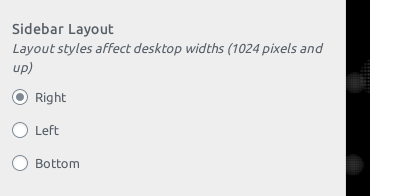
'label' => esc_html__( 'Sidebar Layout', 'theme-slug' ),
'description' => esc_html__( 'Layout styles affect desktop widths (1024 pixels and up)', 'theme-slug' ),
'choices' => array(
'right' => esc_html__( 'Right', 'theme-slug' ),
'left' => esc_html__( 'Left', 'theme-slug' ),
'bottom' => esc_html__( 'Bottom', 'theme-slug' ),
)
) );
}
add_action( 'customize_register', 'theme_slug_customize_register' );
To keep the information destined for the database safe, let’s write a validation callback.
function theme_slug_sanitize_sidebar_choices( $input ) {
	if ( !in_array( $input, array( 'right', 'left', 'bottom' ) ) ) {
		$input = 'right';
	}
	return $input;
}
This checks if any of the choices in our control match the array in the validation function. If none match, then it returns the default. Cool.
To load a file from functions.php, we can add the following and place the above code into the new file.
require_once ( get_template_directory() . '/customizer.php' );
So now, if you were to refresh the Customizer page, you can see our new section and controls, as shown in the screenshot.
Since this tutorial is written for those who are creating or adjusting a theme, I am just going to point to GitHub for the sidebar layout code in Mixin’ Styles. However, if you’ve already developed a theme that changes layout and only uses the Customizer’s refresh method, the code can be adapted as well.
Adding Classes via Body Tag Filtering
The next task is key to the entire tutorial and will be used in the JavaScript based live preview later. Using our Customizer control setup, we will add classes to body_class for each choice with a switch statement. We will add the following code to functions.php:
function theme_slug_body_classes( $classes ) {
    $sidebar_layout = get_theme_mod( 'theme_slug_sidebar', 'right' );

    switch( $sidebar_layout ) {
        case 'right':
            $classes[] = 'sidebar-right';
            break;
        case 'left':
            $classes[] = 'sidebar-left';
            break;
        case 'bottom':
            $classes[] = 'sidebar-bottom';
            break;
    }
}
Layout in CSS
For Mixin’ Styles, I used a CSS Grid layout. Also, with Customizer specific class names prepended to each sidebar layout rule, we do not have to use wp_add_inline_style to dynamically switch between each layout. Instead, we can add the styles to style.css.
For a brief explanation, the #main element has a grid applied with two 1.5em margins on each side. This is in mobile size. In addition, I placed the content and sidebar inside the second and third grid-column.
In desktop widths (1024 pixels and above), the #main element adds approximately 75% and 25% or 25% and 75% for sidebar-right and sidebar-left, respectively. This theme also has a bottom sidebar option.
For the right sidebar, the grid column gets placed in the 4th to 5th column. For the left sidebar, the 2nd to 3rd column. Also, in the left sidebar layout, the row had to start at the top. The bottom sidebar design did not need any change.
If you have your own theme that maybe uses a different layout style, prepend your layout code with the new layout classes. Here is an example for a couple of float layouts:
@media ( min-width: 1024px) {
    .container {
        float: left;
        width: 100%;
    }

    .container * {
        box-sizing: border-box;
    }

    .sidebar-right .container {
        margin-right: -25%;
    }

    .sidebar-left .container {
        margin-left: -25%;
    }

    .content,
    .sidebar {
        padding: 1em;
    }

    .sidebar-right .content,
    .sidebar-left .content {
        width: 75%;
    }

    .sidebar-right .sidebar,
    .sidebar-left .sidebar {
        width: 25%;
    }

    .sidebar-right .content {
        float: left;
    }

    .sidebar-right .sidebar {
        float: right;
    }

    .sidebar-left .content {
        float: right;
    }

    .sidebar-left .sidebar {
        float: left;
    }
}
Live Preview
You can probably guess where this is going. In our live preview JavaScript, which we will get into soon, we are going to use our classes to switch between the layouts. We will implement this with jQuery.
But first, we must adjust our Customizer controls to respond to the JavaScript and add a preview file that controls the display. In the Customizer add_setting code, we can add:
$wp_customize->add_setting( 'theme_slug_sidebar', array(
    'default' => 'right',
    'transport' => 'postMessage',
    'sanitize_callback' => 'theme_slug_sanitize_sidebar_choices',
) );
In addition, if your theme does not already have one, we will create a live preview file and link to it in functions.php:
/* Enqueue scripts for live updating in the Customizer */
function theme_slug_customizer_live_preview() {
    wp_enqueue_script( 'theme-slug-customizer-preview', get_template_directory_uri() . '/scripts/customize-preview.js', array( 'jquery', 'customize-preview' ), '', true );
}
add_action( 'customize_preview_init', 'theme_slug_customizer_live_preview' );
Customize-preview.js is where we will add our code. After, I will describe what the code is doing.
( function ( $ ) {
    wp.customize( 'theme_slug_sidebar', function( value ) {
        value.bind( function( to ) {
            switch( to ) {
                case 'right':
                    $( 'body' ).addClass( 'sidebar-right' ).removeClass( 'sidebar-left sidebar-bottom' );
                    break;
                case 'left':
                    $( 'body' ).addClass( 'sidebar-left' ).removeClass( 'sidebar-right sidebar-bottom' );
                    break;
                case 'bottom':
                    $( 'body' ).addClass( 'sidebar-bottom' ).removeClass( 'sidebar-right sidebar-left' );
                    break;
            }
        } );
    } );
} )( jQuery );
First, we are attaching the theme_slug_sidebar control to wp.customize, so the Live Preview can use it in the backend. Then, we are switching the layout by adding the body class associated with that specific layout. We remove the classes from the other two layouts so they don’t show up at the same time, interfering with each other. Thus, this method works best when your theme only has a few different options.
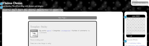
What this means is that your theme’s live preview can have the appearance of major layout changes without refreshing or writing repetitive code to match the front end. Some animated gifs of this idea are below. Thank you for reading.
Featured Image by Josch13 from Pixabay
Leave a Reply