Replacing Image Ads with Text Ads on Mobile Devices
In the course of redesigning this website, I decided that I did not want to display large image ads designed for a traditional sidebar on mobile devices. Often times, too many images and videos will slow down loading under slower wireless connections. Fewer images would decrease loading time. So, I created a customized sidebar that loads two text widgets. One widget is for the desktop, where image ads (such as affiliate ads) are displayed. The other widget is where equivalent text ads are displayed. Then, WordPress’s wp_is_mobile function was used for switching between image ads on the desktop and text ads on mobile devices. In addition, I created a small jQuery file that moves the text ads above the content on mobile devices. In this tutorial, we will add this functionality to an existing theme.
Prerequisites
To follow this tutorial, it is a good idea to develop on a local WordPress Installation. On the WordPress Installation Techniques page, there is a list of several local installation instruction guides under Installing WordPress Locally. Also, you will need a responsive WordPress theme to work with. Even though I implemented this idea in my own personal theme, this should be able to work for most themes. The newest default theme that comes with WordPress (Twenty Twelve) should work here, as I am using standard Codex based techniques.
This tutorial also assumes knowledge on how to navigate in WordPress’s Dashboard.
Getting Placeholder Images
For the purposes of this tutorial, we will use placeholder images for the image ads. Since some themes may have widgets areas that are vertical or horizontal, we will use vertical, button and horizontal placeholders. In this case we will use Adsense sized placeholders. Right click in your browser and Save these files to your computer.


Creating our Widgets
Your theme may have several widget areas. At this point, it is a good idea to select which widget area (in your theme files) that you would like to add the two widgets to. You will need to edit the sidebar file later, in order to add the mobile/desktop ad switcher. In my theme, this is sidebar.php and the html ‘wrapping’ element in question is aside#ads-sidebar. This aside (or div) will be needed in order for the jQuery file to move the content later.
In the WordPress Codex, the way the underlying code is written for registering and displaying widgets has changed, as described in the article Widgetizing Themes. Let’s say you have an older theme that widgetized a sidebar (in functions.php) similar to the following:
<?php
if ( function_exists('register_sidebar') )
	register_sidebar( array(
		…
	));
?>
In order for this to work with our conditional that goes into the sidebar file, we need to create new widget areas using functions for each widget. You can leave the original widgetizing code in your existing theme and add the new functions below that code:
<?php
if ( function_exists('register_sidebar') )
	register_sidebar( array(
		…
	));

function mobile_ads_init() {
	register_sidebar( array(
		'name' => 'Mobile Ads Sidebar',
		'before_widget' => '<li class="widget %2$s">',
		'after_widget' => '</li>'
	));
}

function desktop_ads_init() {
	register_sidebar( array(
		'name' => 'Desktop Ads Sidebar',
		'before_widget' => '<li class="widget %2$s">',
		'after_widget' => '</li>'
	));
}

add_action( 'widgets_init', 'mobile_ads_init');
add_action( 'widgets_init', 'desktop_ads_init');
?>
If you wish to use the default sidebar that WordPress gives you, simply use register_sidebar();
Displaying our Widgets
The next part is the display of the widgets on the front end. So now, we can open up our sidebar where we want the ads to display. In most standard themes, this file is sidebar.php, but some themes may use a different file or more than one file for sidebars. Check your theme’s readme.txt page for more information or browse your theme’s files.
In this file, the existing widgetized sidebar might look like this in older themes:
<?php if ( !function_exists('dynamic_sidebar')
|| !dynamic_sidebar() ) : ?>
...defaults when there are no widgets
<?php endif; ?>
or something like this in newer themes:
<?php if ( dynamic_sidebar('Main Sidebar') ) : else : ?>
...defaults when there are no widgets
<?php endif; ?>
or alternatively like this when there are no defaults:
<?php if ( dynamic_sidebar('Main Sidebar') ) : else : endif; ?>
After the final endif;, add the following code:
<aside id="ads-sidebar"> for html5 or <div id="ads-sidebar"> for html4/xhtml
<?php if ( ( wp_is_mobile() && is_home() ) ) { // display text ads on mobile phones/tablets ?>
	<ul>
		<?php dynamic_sidebar('Mobile Ads Sidebar'); ?>
	</ul>
<?php } else if ( !wp_is_mobile() ) { // display image ads on the desktop ?>
	<ul>
		<?php dynamic_sidebar('Desktop Ads Sidebar'); ?>
	</ul>
<?php } ?>
</aside> or </div>
This conditional statement checks if WordPress is displaying the theme on a mobile device with wp_is_mobile and (&&) if we are on the blog posts page. I specified the is_home conditional to display the text ads only on the posts page. If you wanted the text ads to show on every page, then you can leave out the is_home part and get rid of the extra parenthesis. <?php if ( wp_is_mobile() ) …
Placing our Placeholders and Text Links in the Widgetized Areas
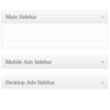
Theoretically, you can place any widgets in each widgetized sidebar, but for the purposes of this tutorial, let’s use text widgets as intended. If you are in the Widgets section of your Dashboard, you should now see your two new widgetized sidebars “Mobile Ads Sidebar” and “Desktop Ads Sidebar”.
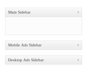
First, drag a Text widget to each of those sidebars. You can give them both a descriptive title (such as “Ads”) and Save each one.
Second, we can get the placeholders. The easiest way to use these is to upload them to your Media folder. The following instructions work with newer versions of WordPress.
- In the Dashboard select Add New under Media. From here, you can drag and drop the files or choose Select Files
- Once the file is saved, go to Library, under Media and click the title of the file you just saved
- Under the Save section, highlight the File URL of the image and Copy (Ctrl/Cmd – C) the file
- Back in the text widget for the desktop, Paste (Ctrl/Cmd – V) the url inside the Desktop Ads Sidebar text widget. If you were actually copying and pasting codes for your ads, they would be pasted here. You can do this for as many ads as you would like to display
- Save the “Desktop Ads Sidebar” text widget
- In our Mobile Ads Sidebar widget, you can type in an equivalent link ad. For instance here, you can type
<a href="#">Perfect location for an Adsense ad.</a>. Selecting Automatically add paragraphs adds paragraph tags around each link. Any html can go here, though. - When pasting affiliate code, check to see if there is a similar text ad match for the image ad you’ve selected for the desktop. If there isn’t one, you can manually create a link with similar wording. Affiliate programs usually display your basic affiliate link as a url
By this point the ads will be switched on mobile phones. You can check this on a desktop computer if you are using Firefox and the User Agent Switcher extension. At this point, the text ads remain in the sidebar. For some layouts, this may be adequate, but if you have a sidebar on the side, you may want your text ads to be somewhere toward the top on mobile displays for prominent placement. For this, we will create and enqueue a jQuery script.
Moving Mobile Ads with jQuery
The first thing we can do is create a script. Create a new file in a text editor and Save As moveAds.js in your theme’s main folder. Alternatively, if your theme has a dedicated folder for scripts named scripts or js, you may save it there, as the path to the script can be adjusted later. Type the following into the script file:
jQuery(document).ready( function( $ ) { // opens document ready
	/* prepends ads sidebar before main content section */
	$('#content').prepend($('aside#ads-sidebar'));
	//$('#content').prepend($('div#ads-sidebar'));
}); // closes document ready
Now, this script assumes that the main div (or main tag) has an id of content, for example <div id="content">. A way to check the name of the tag that surrounds your content is to right-click the page and use the browser’s Inspect Element feature (most browsers have Developer Tools available). If your theme’s files use a class, change the #content part to .content. Also, if you have an html4/xhtml based theme, uncomment the ‘div’ prepend part and comment out the ‘aside’ prepend.
This script prepends the ads to the top of the content area. The script’s prepend, .prepend(), is a jQuery content manipulation method. Others include .after() and .insertAfter(), which insert content after another element. For instance, that would insert our ad code after the header, but before the content div. For more, check out the Manipulation page in the jQuery documentation.
Enqueueing the Script
Now, we must register and enqueue the script in functions.php. We only want the script to be loaded in mobile browsers and on the home page, just like we did in the sidebar.
<?php
// Move Ads script for mobile
if ( ( wp_is_mobile() && is_home() ) ) {
	wp_register_script( 'move-ads', get_template_directory_uri() . '/moveAds.js' , array( 'jquery' ), '1.0' );
	wp_enqueue_script( 'move-ads' );
}
?>
If you placed your script into a folder, adjust the path above accordingly. For example '/moveAds.js' would be replaced with '/scripts/moveAds.js'.
In your responsive theme, you may have to adjust some CSS. In my theme, I just needed to reset the margins that applied to the sidebar on desktops. Open your theme’s main stylesheet style.css and look for the media queries that target tablets and mobile phones (Usually this is noted in comments). It will begin with @media … and will specify a max-width (max-width: 1024px), for example. Your theme may also contain floated elements and narrow widths for sidebars on tablets. In that case, you can uncomment the float and width style rules below. Copy and paste this margin reset into the mobile and tablet media queries:
/* for use with moveAds.js prepend script */
aside#ads-sidebar .widget,
aside#ads-sidebar li {
	margin: 0;
	/*float: none;*/
	/*width: 100%;*/
}
/* */
Conclusion
That’s how to replace ads and then move them to center stage on mobile devices. Do you think this is worthwhile to implement on a website? Let me know in the replies below. Thank you for following this tutorial.