Fix for WordPress Admin Bar with Skrollr in Mobile
If you have created a WordPress website or theme that uses skrollr.js, you might know that it uses an alternative variation of scrolling for mobile devices, since mobile devices delay JavaScript execution to save battery power, according to the library’s GitHub page.
Thus, skrollr fixes this issue by having the developer add a skrollr-body id to an element on your page. I added this id to my theme’s body tag in header.php. When this id is added, it will actually fix the content inside of the element with the skrollr-body id into place. It will then scroll the content.
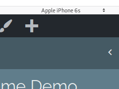
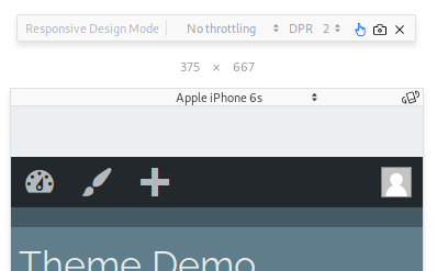
If you apply this id to the body tag and you are logged in to WordPress, you will notice that the admin bar covers up the top of the header the same number of pixels tall that the admin bar is, as shown in the screenshots shown below.
WordPress admin bar misaligned in mobile width
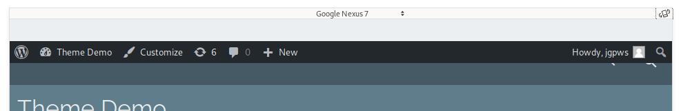
Admin bar misaligned in desktop width, but in a mobile environment.
At least this was the case in my theme. This tutorial aims to fix that issue with CSS. Also, of note, this may only be necessary if skrollr-id is applied to an element which has a height starting at 0px, such as the body element.
For this tutorial, you will need to use a browser’s Development Tools, particularly something that differentiates between desktop and mobile environments. A user agent switcher can work well here, but any development tool that acurately emulates mobile scrolling will work. Skrollr uses touch events to add the classes skrollr-mobile when detecting a mobile device and skrollr-desktop when on desktop. It is the skrollr-mobile class we will use.
Since I’m using the Underscores theme and Sass, I added a header.scss file as a partial include, and added the code to that file. Otherwise, it can be added anywhere in your Sass files or to style.css.
Looking at the screenshots above, you can see that extra space has been added above the admin bar. Let’s fix that:
html.skrollr-mobile {
    margin-top: 0 !important;
}
In order to test this, select one of the mobile presets in your Developer Tools. Since I’m testing with Firefox, I selected one of the Apple iPhone presets in Responsive Design Mode. Make sure Touch Simulation is activated. If it is, you will scroll by dragging the mouse across the screen. Inspecting the <html> tag, you will see that the skrollr-mobile class has been added. Using this class, we can remove the margin at the top.
.skrollr-mobile .logged-in .site-header {
    margin-top: 46px;
}

@media screen and ( min-width: 783px ) { /* min width where wp admin bar shrinks to 32 px */
    .skrollr-mobile .logged-in .site-header {
        margin-top: 32px;
    }
}
In mobile environments with desktop widths, the site header shrinks to 32 pixels after a max width of 782 pixels. The !important rule is necessary, as the margins are hardcoded. Alternatively, you may use the admin-bar class in place of logged-in.
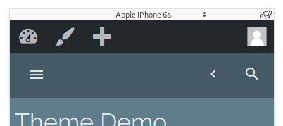
Admin bar with correct alignment in Skrollr
That’s it! Skrollr.js mobile scrolling effects will now work with WordPress’s admin bar. On a side note, if you have anything with fixed elements within the body, it can be problematic because fixed elements will be fixed in place possibly outside of the viewport. Indeed, on the skrollr.js GitHub page, the author recommends placing skrollr-body on an element that only contains static elements. In many places, including my theme under development, this can be a problem when using in-content elements that use CSS fixed positioning, such as lightbox popups. I’d say use the skrollr-id function only if you know you won’t have fixed positioned elements within the body. For my theme, I may need to find a workaround, as it includes Colorbox.
Leave a Reply