Mixin’ Styles- GB 1.5 Introduces Contrasting Colors to the Site Editor
My latest update to Mixin’ Styles- GB, 1.5, is pretty massive! However, you will probably see minimal changes insofar as new features go.
The new changes are more about usability. The biggest change I worked on in this update was to make the Site Editor (and Block Editor) match the front end. Let me explain.
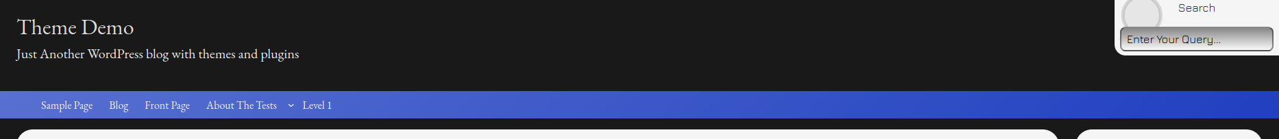
The front end of the theme has an auto contrast script that changes the colors of certain blocks depending on the lightness or darkness of the background color. Think blocks like the Pagination block and the default lines above and below the default navigation.
In the Site Editor, there was no similar script to update the contrast. So, this is the main bulk of the work in this newest update. It was also the most challenging, as I enlisted the help of AI, using Google’s online AI tool.
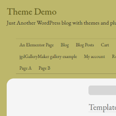
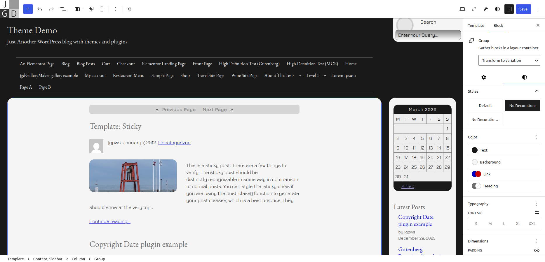
Site Editor Back End Matches the Front End for Light and Dark Contrasting Colors
The screenshot above shows what happens in the Site Editor when you apply a dark background color to a card. The contrast script updates the Pagination, Calendar blocks and the Post Title links to a lighter color.
With this, you will still have to change the main text color and link colors manually. The dark themes have lighter variations for text and links that you can use.
Foregrounds also change for global color schemes, as you can see the darker lines above and below the main navigation, as well as the darker Site Title.
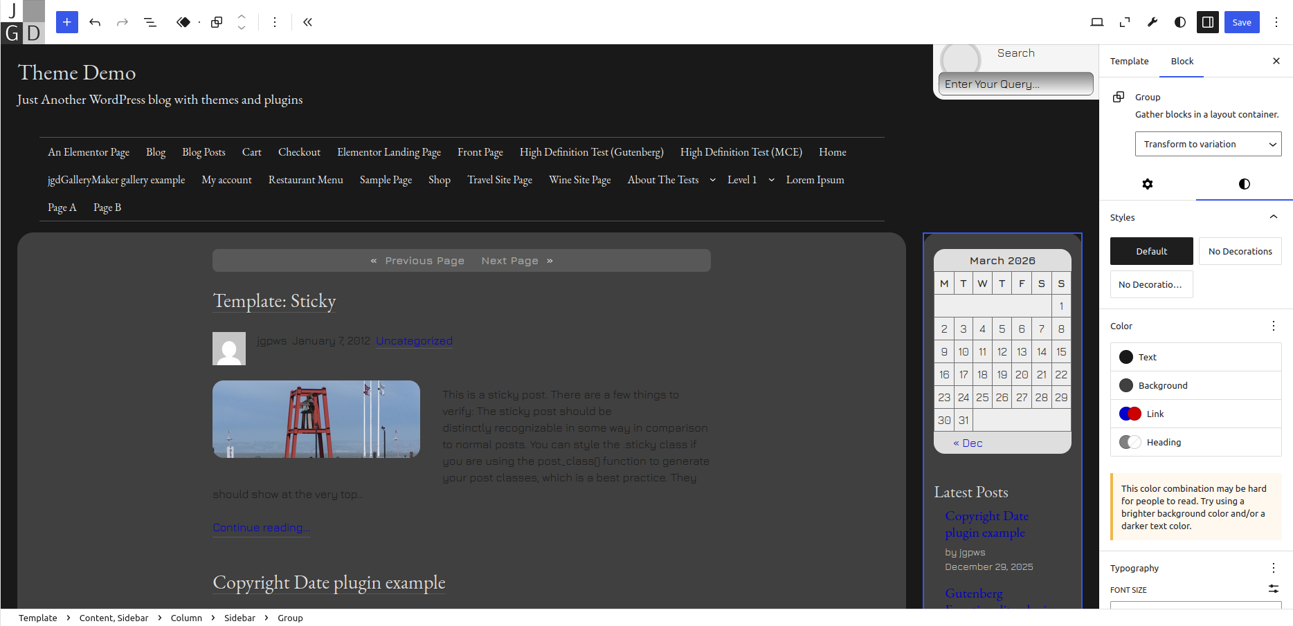
Added the Contrast Script Capabilities to the Thin Header and Flat Navigation Block Styles
Piggybacking off the above information, the theme also adds contrast styles to the Thin Header and Flat Navigation styles, as shown below:

Reorganized Fonts to use Heading and Body Typesets
In previous versions of Mixin’ Styles- GB, all fonts were listed under the Fonts section and you could apply them to the body or various blocks. That functionality still exists, WordPress 6.6 introduced the concept of Typesets.
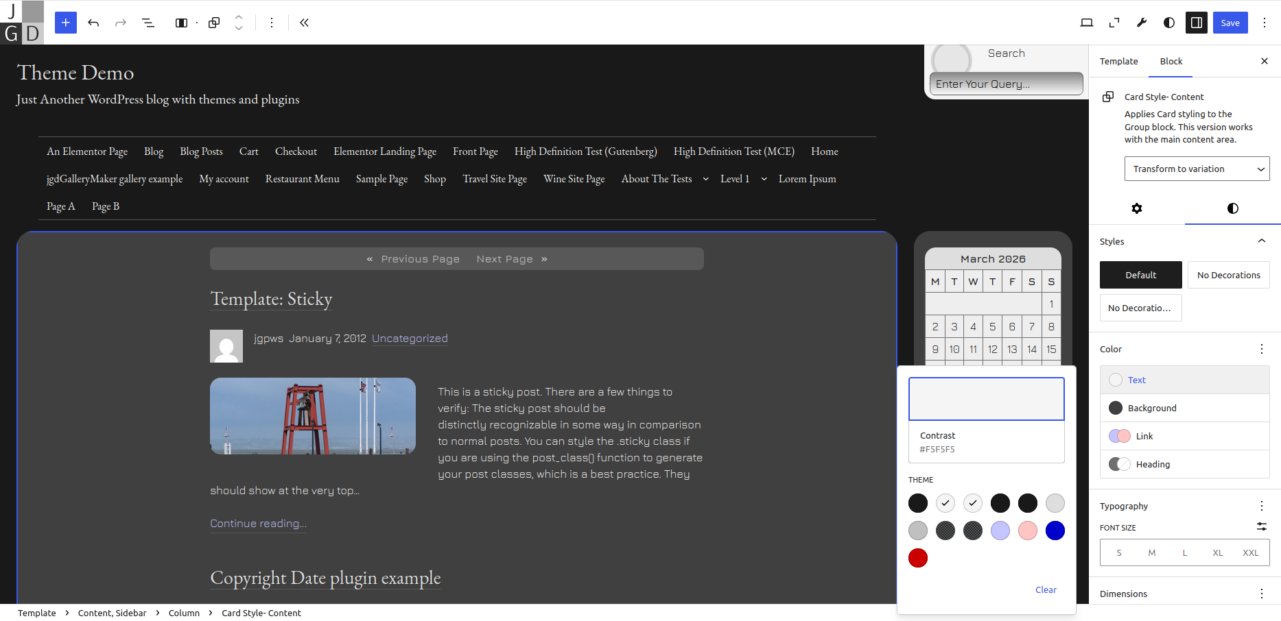
Mixin’ Styles- GB 1.5 reorganizes fonts to specify one font style for the main text and an optional second style for headings, as shown below:
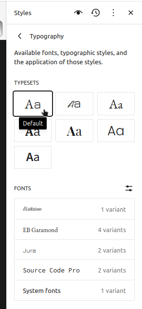
Before, any preset type was included as part of a global color style. Now, you can apply fonts independent of the color scheme.
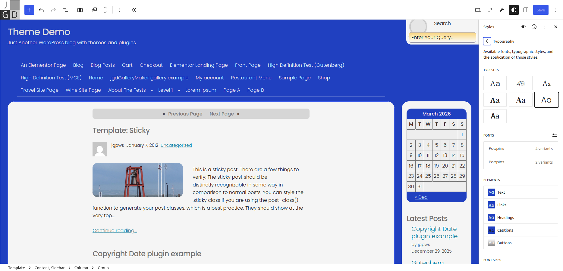
In the screenshot below, the Poppins typeset is applied with the Blue/Orange color scheme and No Decorations for the parent Group (more on that later).
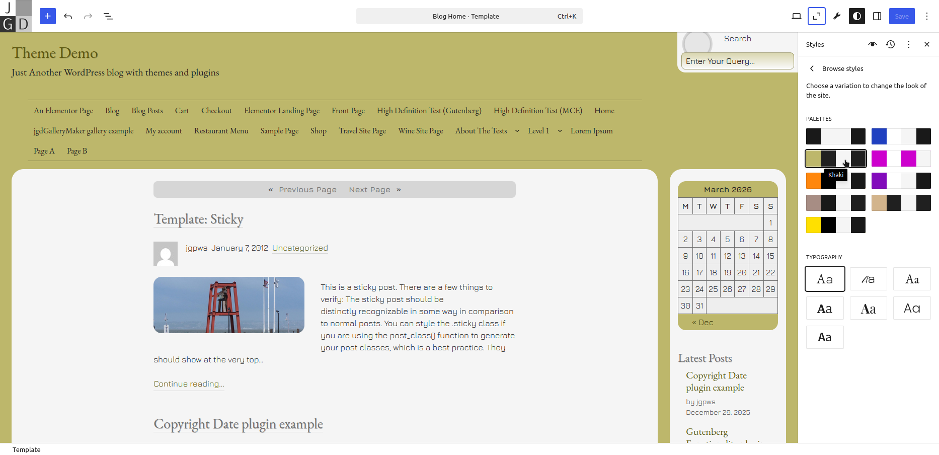
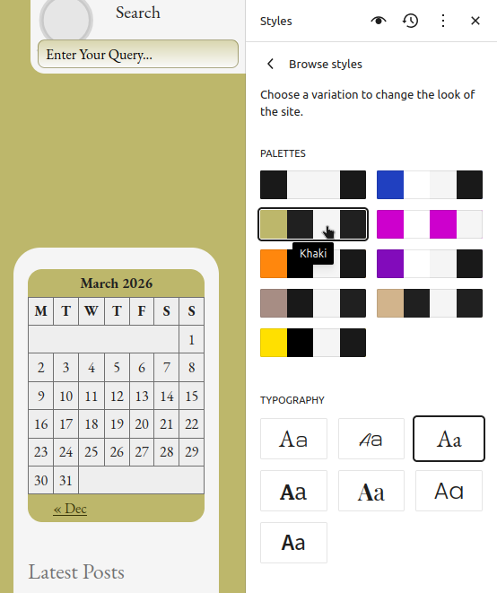
Reorganized Color Schemes to Use Palettes
Newer versions of WordPress have pure color schemes that only reference color changes. In previous versions of Mixin’ Styles- GB, color schemes were global, mixing in with fonts and other styles, now it uses WordPress 6.6 based Palettes.
The Group Block Now Has a No Decorations Option
Previously, there was a block style to remove the decoration (underlines) around only Post titles. The theme removes the Post Title block style in favor of a No Decorations style for Group blocks.
I also added arrows for the default marker on list items for certain blocks. The No Decorations style removes these, as well as text shadows wherever used, and underlines for Post Titles. I also added a No Decorations (with Arrow Markers) style, should you want to keep the arrow styling on lists.
Moved Shadow and Outline Block Styles to the Post Content Block
The Group block used to have shadow and outline styles. Mixin’ Styles- GB 1.5 now moves these styles to the Post Content block, as now documented in the revamped post Exploring the Block Editor’s Drop Shadows.
Conclusion
Most of the new changes for version 1.5 were more for the user experience, to make things flow more smoothly. Secondarily, it was in order to bring the theme to use more modern WordPress features. If you are using this theme, I hope the difference is clear.
Leave a Reply