Previewing A Website in Screenfly
I just wanted to mention a great resource I used with the redesign of this website and with a recent client’s website: Screenfly. Similar to Firefox’s Responsive Design View, Screenfly lets you view your website design in many different resolutions. Simply type in the web address from the front page and hit Go. It recognizes localhost too, so you can test web pages on your local computer.
The first three buttons at the top are for Desktop, Tablet, Mobile and even Television. Under each are an array of screen sizes for the currently popular tablets and mobile phones. You can also add scrollbars to the side of the screen space. This is a must for responsive web designers. I recently designed the website for capoeiradtla.com. Here are screenshots of that website in desktop, tablet and mobile sizes (Clicking each thumbnail leads to a larger view size- hit the Back button to get back to this page).
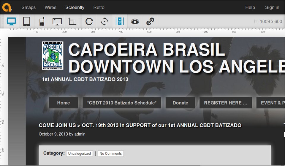
A website in the 13″ Notebook size (1280 x 800)
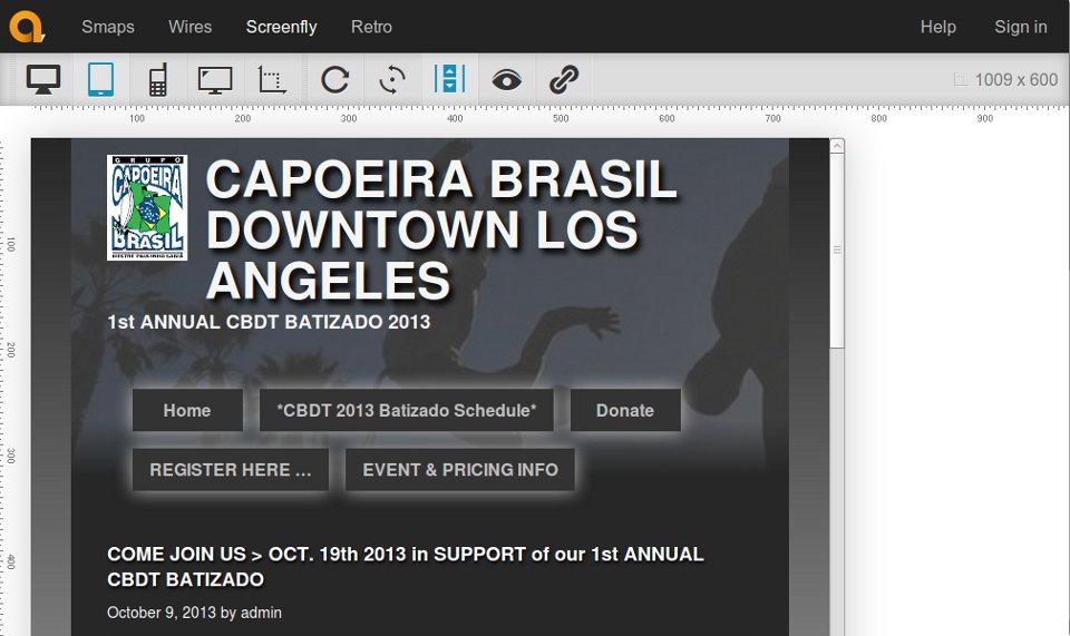
A website in Apple iPad size (768 x 1024)
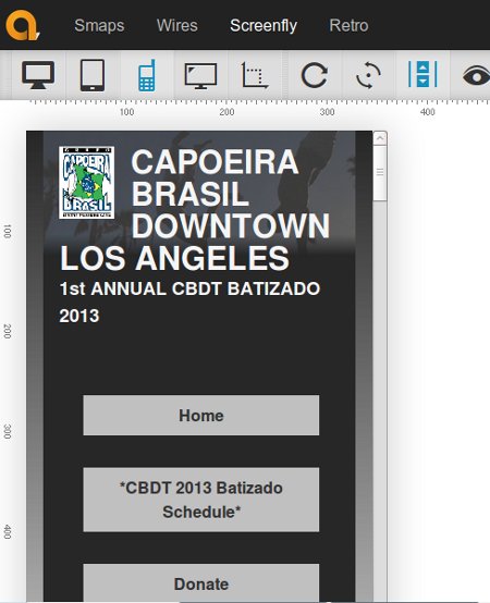
A website in Samsung Galaxy s3/s4 size (360 x 640)