Jason G. Designs New Look Preview
As everyone in web design knows, times change and so does technology. The more I looked at my existing theme against current web design trends, the more outdated my original theme looked. For example, the current design uses background images to section off sidebar and content backgrounds. It is also fixed width. This was fine for a website destined for only the desktop, but nowadays it is (almost) a requirement for websites to be responsive.
The New Responsive Design Preview
I will be redesigning with a new responsive theme for this site. I entertained the thought of keeping the same look and adjusting the layout and images of the existing theme, but since I am making the theme responsive, why not go with a new look as well?
I’ve gotten as far along as creating mock ups in Gimp. Below are preview images of the new design in desktop and handheld widths.
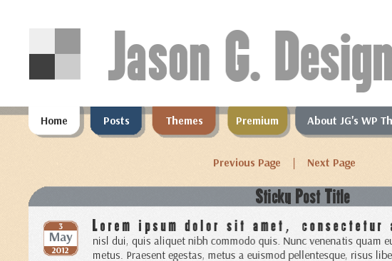
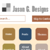
Jason G. Designs 2 desktop view
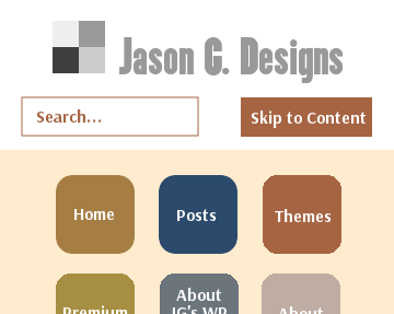
Jason G. Designs 2 mobile view
Some of the new features will be:
- A more simplified static home page without sidebars or a footer
- Buttons to replace tabs in mobile view
- Third “Ads” sidebar moving to center content area on mobile phones/tablets
- Ads in mobile phones and tablets will be text based replacements using the wp_is_mobile function
- Fully fluid layout
- Featured images with sizes that scale for mobile devices
- HTML5 underlying code and CSS3 features
After learning from the creation of this new design, I plan to implement many of these features into new, upcoming themes. Stay tuned.